
Curated and developed Grazie’s digital presence. Focused on selecting the most compelling visuals—from commissioned photoshoots and relevant stock libraries—while ensuring authenticity and menu accuracy. Each post maintained tone alignment with the restaurant’s evolving aesthetic.
"Keep it true to what we serve."
Balanced image-text ratio with consistent framing for brand uniformity.
Form & Function : Digital posts for Instagram, Tiktok, etc. For Giveaways and Promotions.

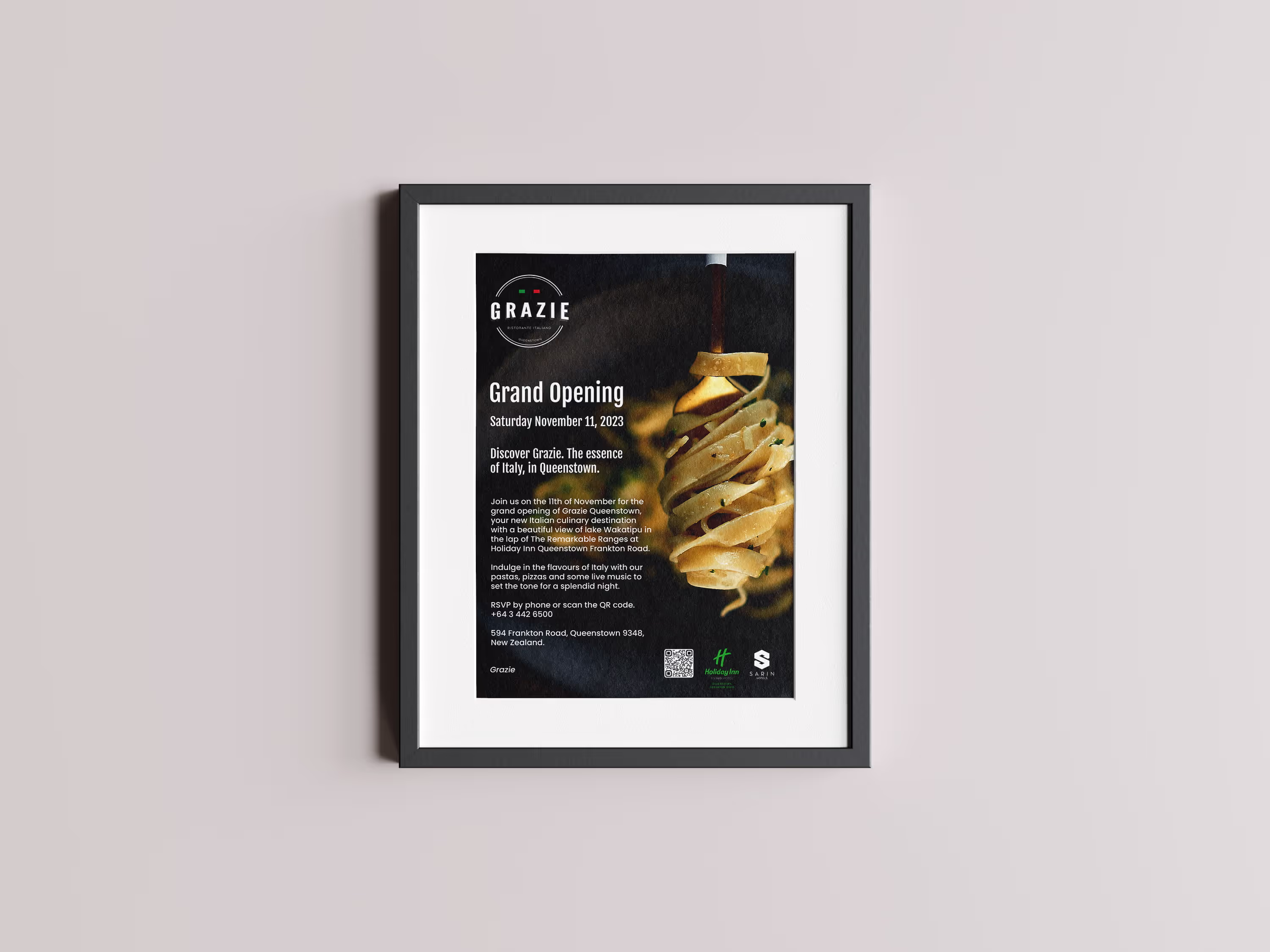
Designed and adapted Grazie’s opening day poster suite. Core visuals were translated across print, email, and digital formats to create a unified invitation system for guests and partners.
"Should be on-brand, we've established an identity."
Print-first design with seamless adaptation to digital invitations.
Form & Function : A4, A3 print posters & Instagram posts. For Launch Invitation and event promotion.
Produced both a print poster and a digital invitation post for a live jazz night with local musicians. The design emphasized mood through type, minimal palettes, and expressive composition. Use of appropriate visually appealing illustration describing the event visually.
"A bit creative."
Music-led typography, nocturnal tones, and quiet flair.
Form & Function : A4, A3 print posters & Instagram posts. For event Invitation and promotion.

Created full campaign visuals for Grazie Lower Hutt’s Wellington on a Plate burger entry — Porkland. Developed posters, menus, and catalogues using the provided photography and brief. Built a month-long content arc for social. All copy was written in-house to align with event energy.
"We need to find space to put the Chef's ideas on the paper."
Integrated print and digital assets shaped by photography and product hierarchy. Chef's words on the inside left of the catalogue along with the Burger description. Voting QR placed for easy access.
Form & Function : A4, A3 print posters, Instagram posts, Flyer Catalogue Tri-fold for the duration of the competition. For product launch and promotion.


Designed a range of small-format table signages for seasonal offers, competitions, and updates. Visual coherence across all cards, built for quick scanning without compromising the aesthetic.
"Ensure easy access to reservations."
Text scale and layout optimized for short-range legibility in ambient settings.
Form & Function : A5 sized posters with product and offer descriptions. For product and service promotion.


Developed outdoor signages across Grazie’s venues in Queenstown and Wellington. Involved visual selection, copy development, and layout to ensure visibility without overwhelming. Signage held up visually against varied urban backdrops.
"Must be good on the eye but readable at the same time."
High-contrast visuals and reduced text density for instant street-level recognition.
Form & Function : Custom sized posters with appealing visuals and relevant text. QR for easy reservations access. For product and service promotion.


Menu design support for Grazie’s annual event calendar. Each menu is tailored to match event mood while retaining house style. The changes are well reflected in the changing illustrations based on event.
"We'll keep it close to the main menus."
Minimal layout with intentional spacing and adaptive seasonal structure.
Form & Function : A4 sized Menus with appealing visuals and text straight from the Kitchen. Adding to the dining experience.

Book a 20-minute consultation to explore how Verbsworth can support your creative function and strengthen your market presence.
